I had never made a piece of work with the intention of teaching others how to fold. In the first place, I thought that the works I could make with my own ability would not be attractive enough to teach others. I was also afraid that if I tried to make my work as simple as possible in order to “teach others,” I would limit the range of my expression.
However, even simplicity can become beauty if it is mastered. Through this work, I have come to believe that.
CONCEPT
1-1. Coexistence of ease of folding and design
It is difficult to create a work that is easy to fold with a great finish, because good design is constrained by ease of folding. But then it occurred to me that even within my own works, the simpler shapes have a more beautiful appearance.
I had been thinking about this, but then it occurred to me that the pieces I have folded in the past have ended up looking more beautiful when they were easy to fold.
If a shape that is easy to fold is naturally harmonious, then why not just fold it in a way that is easy to fold? So, I decided to pursue the concept of easy folding.
1-2. Folding paper in my mind
I think the most important ability in origami design is the ability to know what the paper will look like when folded. That is to say, the ability to fold a virtual piece of paper in your mind.
I’ve been working with origami for a long time, and I’m finally starting to be able to imagine some of the shapes I can make by folding paper. However, it is difficult to imagine how big it will be. It is very difficult to always think about how much paper area will be folded by folding.
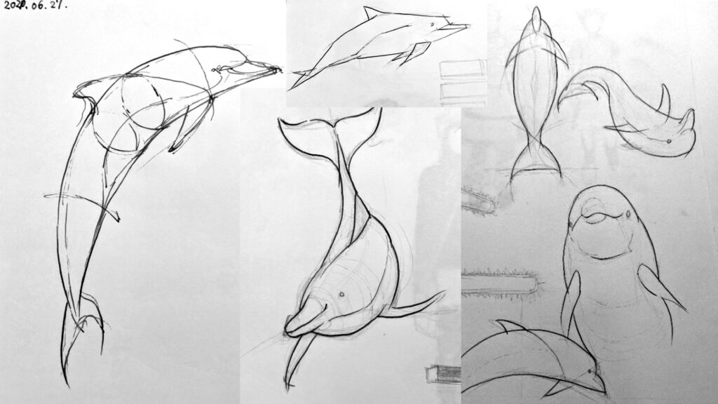
Nevertheless, it is very important to represent the legs and head of a creature in the correct proportions in order to express the creature’s character. The theme of this year’s workshop was to understand the exact proportions from a sensory perspective.
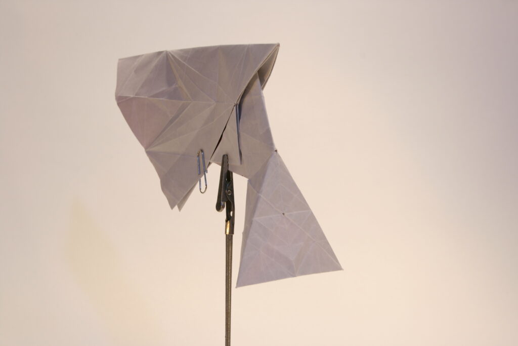
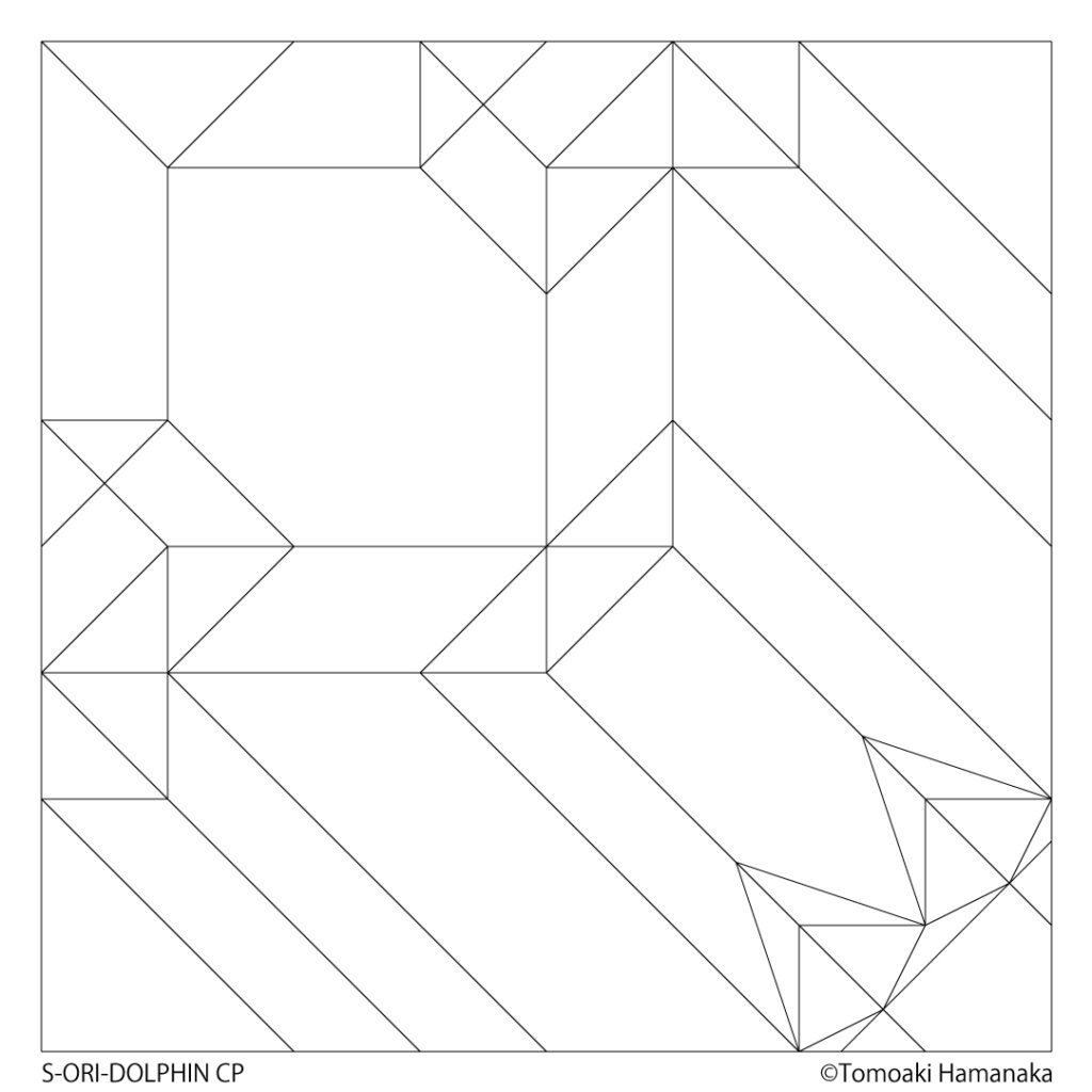
1-3. Expressing a creature with only straight lines
There is nothing in nature that is made of straight lines. You could say that there are no straight lines in nature. Straight lines are created only when they are drawn by humans. But strangely enough, a lion and a tree drawn with only straight lines look like a lion and a tree. In other words, even if there are only straight lines, it is possible to express “lion-like” or “tree-like” qualities.
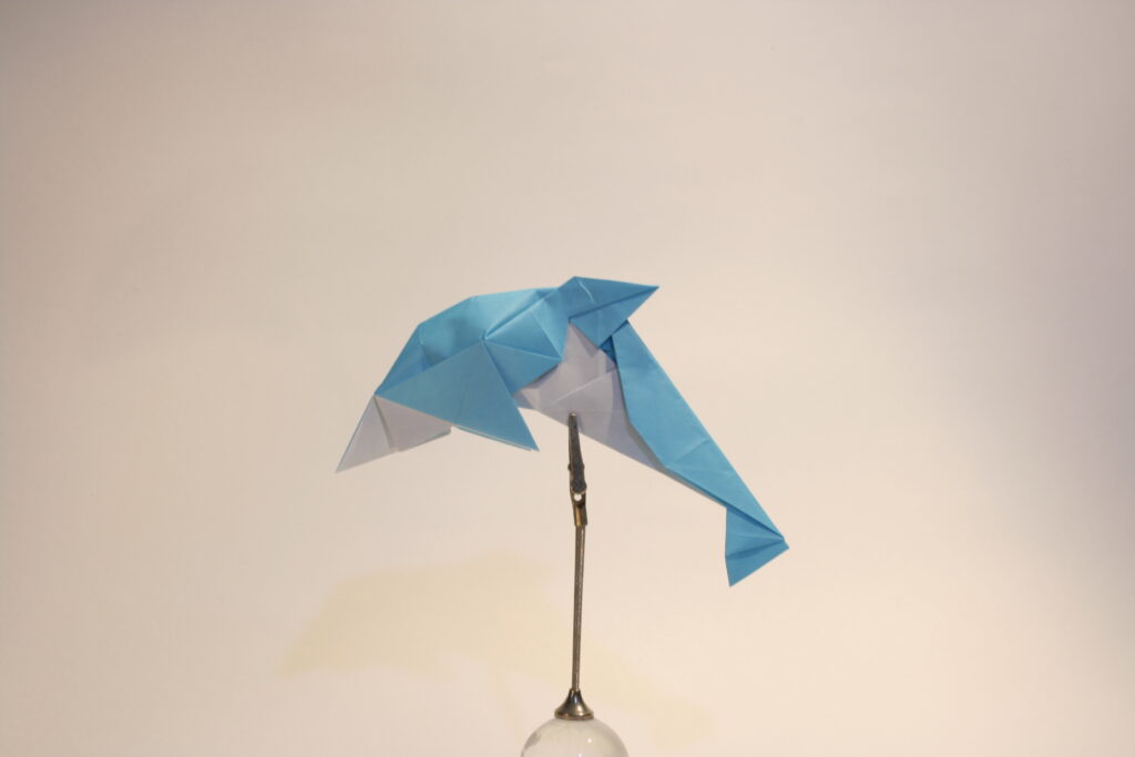
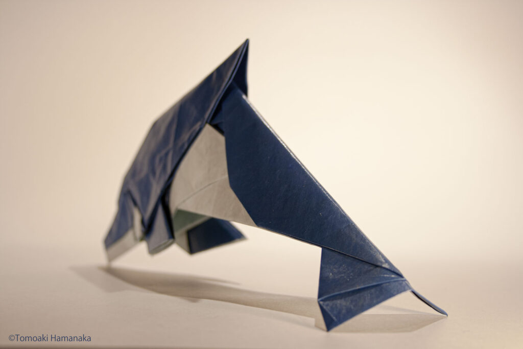
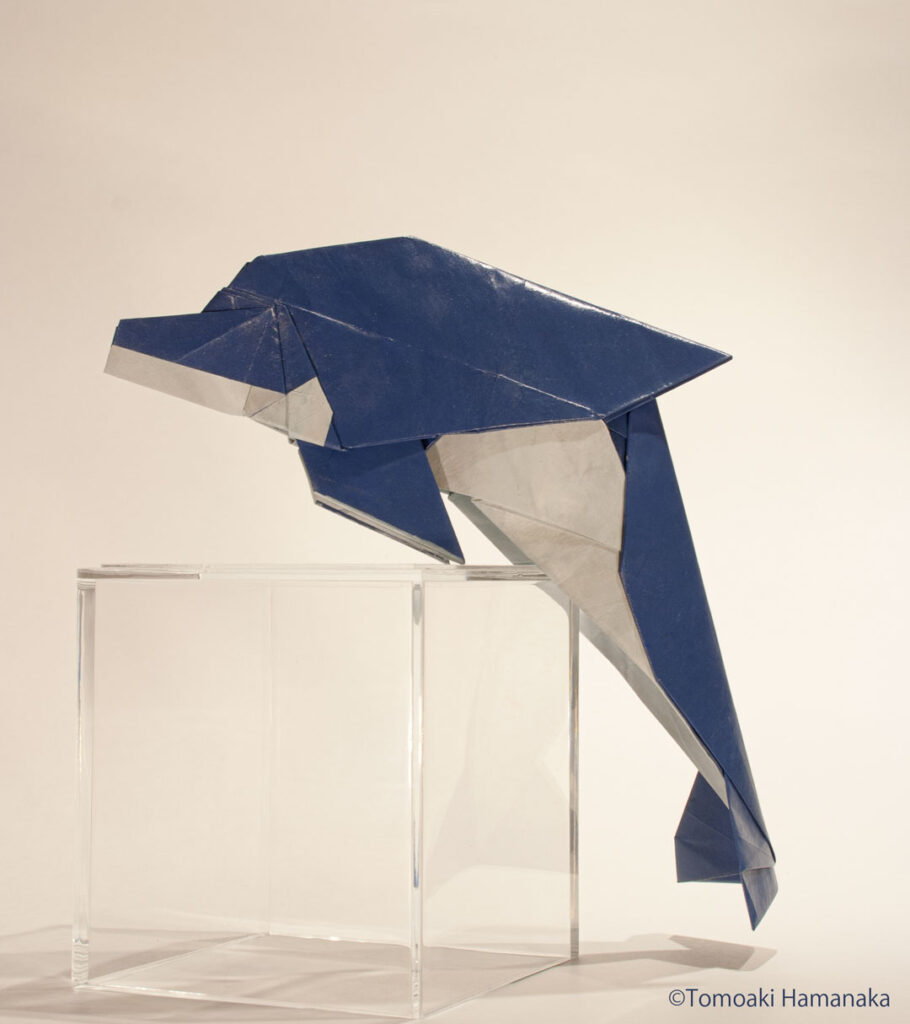
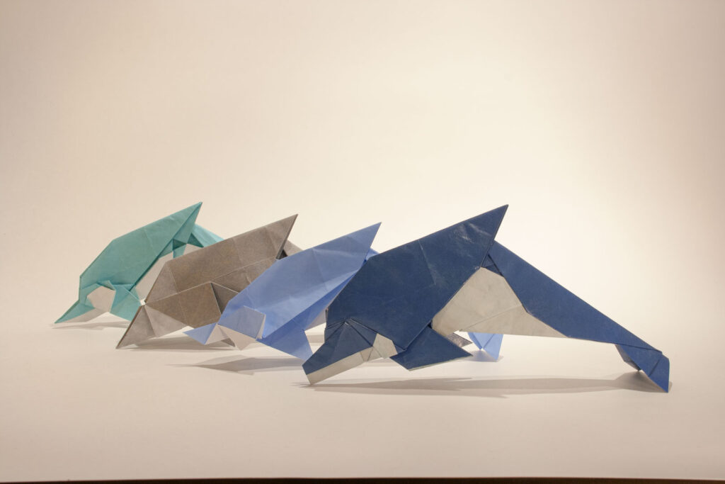
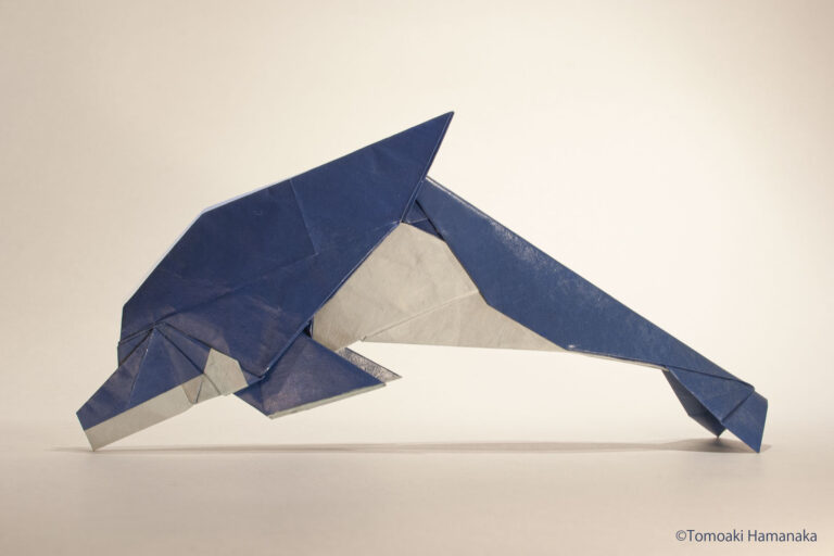
In this project, I tried to do so with the theme of dolphins, which are characterized by their beautiful curves.
DESIGN
2-1. Understanding Dolphins
First of all, I need to know about dolphins. I looked at illustrated books, searched for pictures on Pinterest, and watched videos to deepen our understanding of their ecology and shape.
During this process, I noticed that when I see a blue and white streamlined object, it somehow looks like a dolphin, even if it has no fins or anything. It may just be because I think “dolphin”, but dolphins seem to be familiar to me to the extent that dolphins are an option in my reflexive thinking.
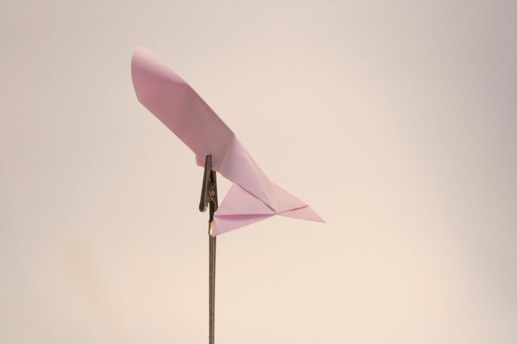
2-2. Expression of the dorsal fin
In most of the origami dolphins I’ve seen in the past, the dorsal fin was basically folded out from the center of the paper. As in my case, I used the exact center of the paper to represent the dorsal fin.
The easiest way would be to use a right angle bisector as the dorsal fin. However, if I did that, it would look like a shark for some reason. I think this is because the dorsal fin of a shark is more like a right triangle and is also longer than that of a dolphin.
To solve this problem, I decided not to change the structure of the right triangle, but to express it as a slightly bent body. As a result, the dorsal fin appears to be tilted at an angle, closer to that of a dolphin.
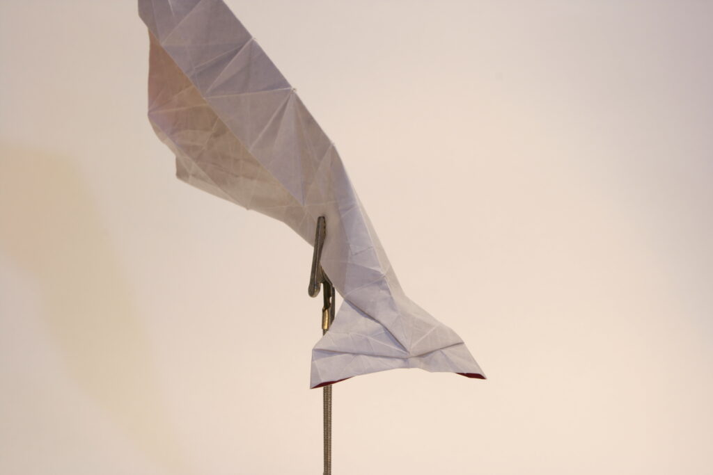
2-3. Expression of the tail fin
Initially, I was thinking of expressing the tail fin as a simple triangle. However, it soon became apparent that this would not match the resolution of the dorsal and pectoral fins. So, I searched for a more realistic representation.
In the end, I chose a structure that I found while experimenting with the 22.5-degree system, and folded it in the integer-angle system, which was difficult to incorporate in the 22.5-degree system, but I was able to fit it into the grid of bellows in the integer-angle system.
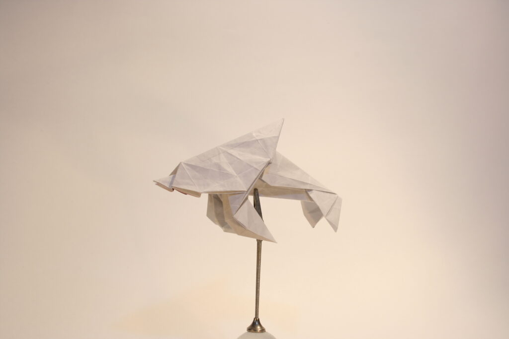
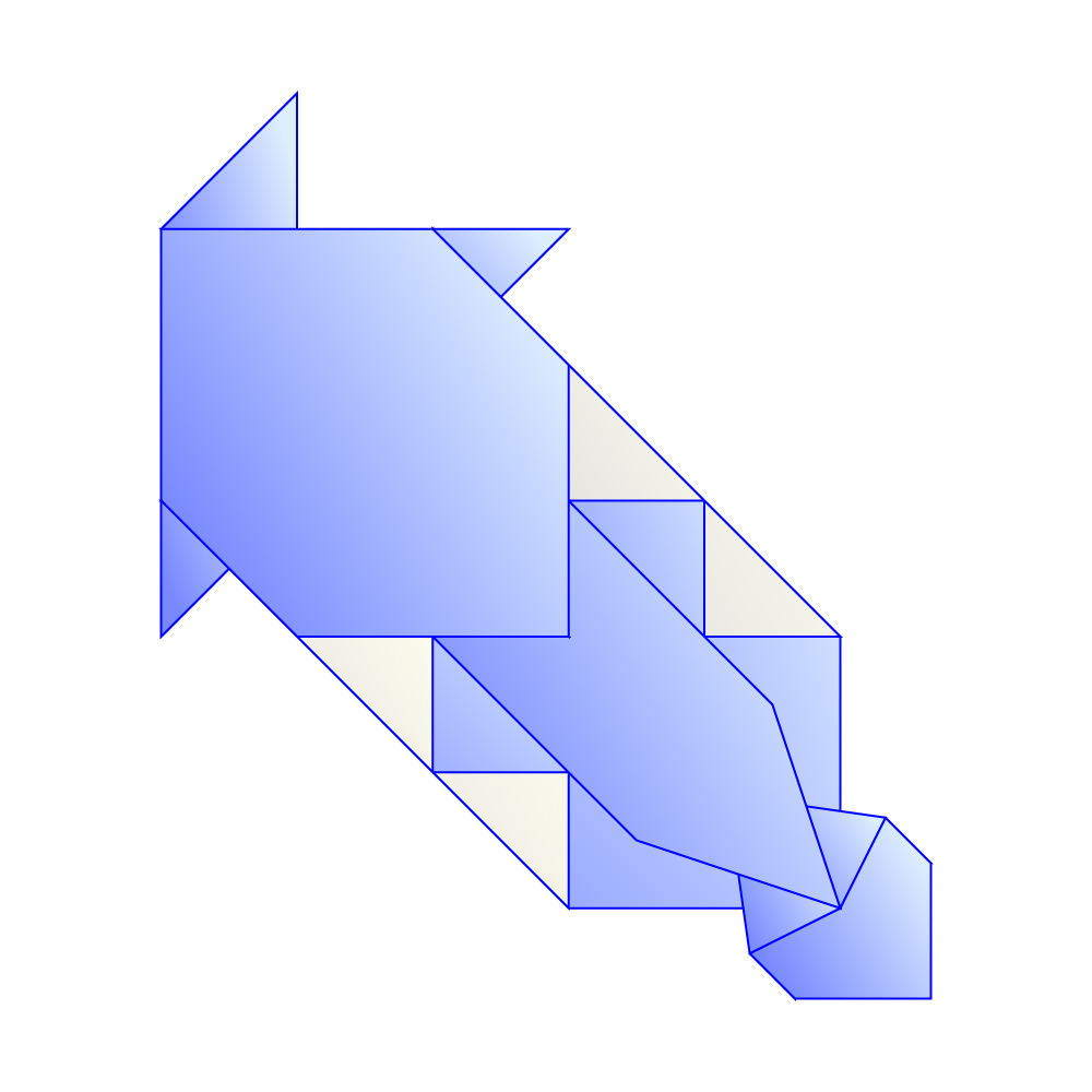
2-4. body to head expression
I struggled with the position of the corners of the pectoral fins. The easiest way was to use the overlapping paper used for the dorsal fin, but if I didn’t think about it, the pectoral fin would look too big or appear to be coming out of an odd position.
In the end, I was able to adjust the position of the pectoral fins by reducing the width of the fins in the middle, for the dorsal and tail fins, to half of the basic grid.
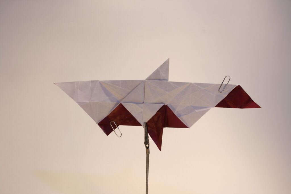
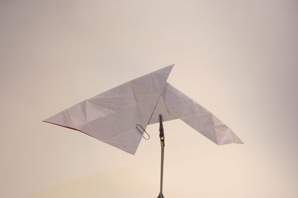
COMPLETE SHAPE
CREASE PATTERN
LIMITATION
4-1. finding the structure
In order to find the right structure this time, I had to go through trial and error by actually folding the paper many times. Of course, a certain amount of practice is necessary, but I feel it is necessary to be able to place each part appropriately in the paper more sensitively.
4-2. Accuracy of the abstraction
For me, the integer angle system is easier to handle than the 22.5 system. For this reason, I prefer integer angle system, and I think it will lead to my uniqueness. However, the integer-angle system sometimes has too many limitations, which makes it difficult to fold. I would like to be able to combine the ease of folding with the beauty of the design.
THANK YOU!
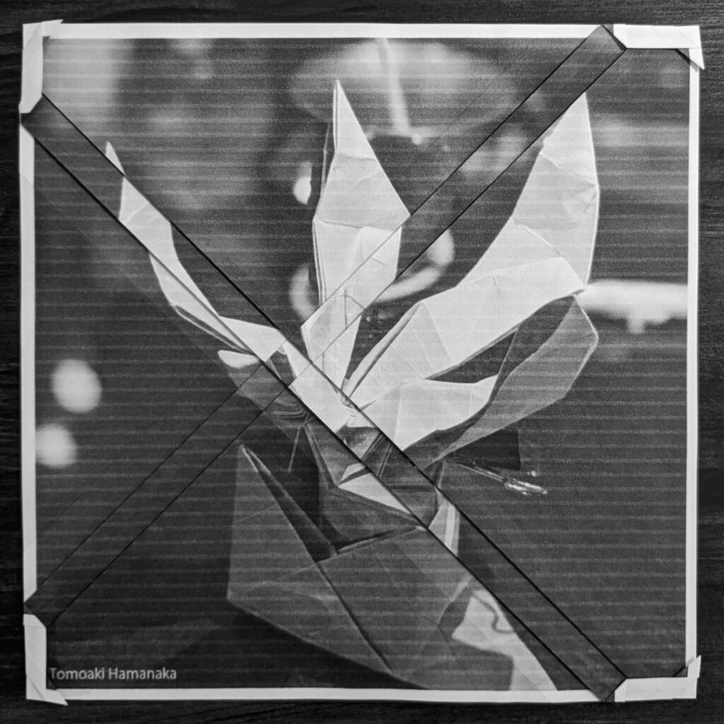
For simple works, I decided to publish the development diagram of the basic form, so if you are good at folding, I hope you will give it a try. I also wrote about the process of creation in relative detail, so I’d be happy if it could be of help to someone else.
I will continue to update this page about once a month, so please bear with me if you do.
It is difficult to create a work that is easy to fold with a great finish, because good design is constrained by ease of folding. But then it occurred to me that even within my own works, the simpler shapes have a more beautiful appearance.
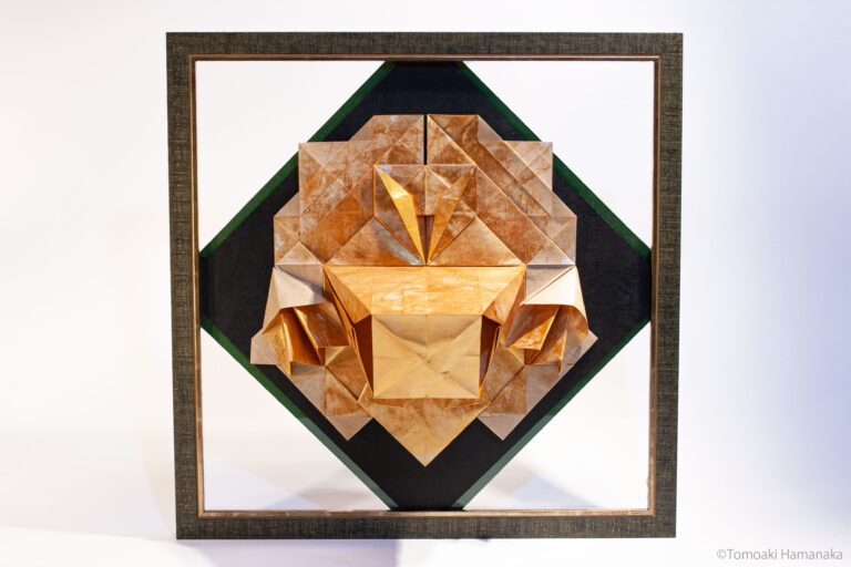
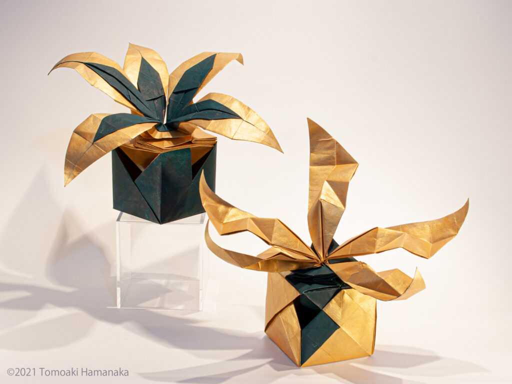
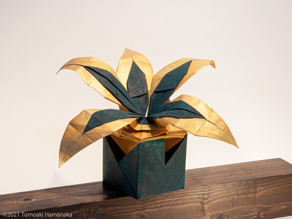
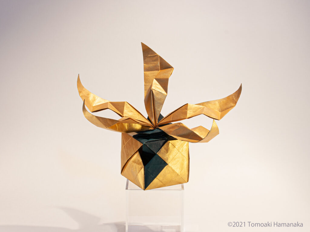
I coined the name “ORI-INTERIOR” for this site because I wanted to create a culture in which people can display origami in their daily lives.
Origami, being made of paper, is light and can be easily displayed on walls and desks. The question is, how can we create works of art that blend into our daily lives?
A simple solution would be to use something that is already part of our daily lives. For example, houseplants or objects that hang on the wall.
In the process of designing such a subject, we can understand the elements necessary to decorate it in a comfortable way. That’s why I started this project with the theme of houseplants.
CONCEPT
1-1. Abstracting Houseplants with Origami
The main concept of this project is the abstraction of houseplants. I break down the elements that make up a houseplant, and extract and reconstruct those that have a high affinity with origami.
By doing so, I aim to create something that looks like both a houseplant and paper.
I think that when we interpret a word, we compare it with the vague image we have of it. For example, when you see the word “houseplant,” that’s what you think of in your mind.
I want to actually take that vague image in my mind and look at it carefully.
That is why I want to make works that seem to waver on the boundary between the object itself and the origami.
In addition to this reason, there is also a more practical reason. As long as I am using paper, there is a limit to the number of corners I can efficiently create and the colors I can use.
Like a minimalist, I feel that paper is a material that requires me to maximize the power of limited resources and to push them to the limit.
1-2. Seamless connection between organic and inorganic expressions
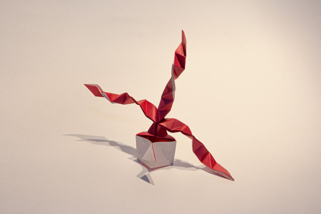
In most houseplants, the upper part of the plant is made up of organic matter, while the lower part is made up of inorganic matter such as potted plants. The composition of the present work is the same.
The material of paper connects the opposites of organic and inorganic materials to create an expression that is both organic and inorganic.
I was always thinking about how to mix them together in the most appropriate way.
DESIGN
2-1. Consideration of structure from observation
In this work, I did not dare to do much sketching. Instead, I touched and observed the real thing. By observing both the fake plant and the living plant, I tried to feel the difference between them.
What I wanted to represent was something in between.
When I first started, I struggled to increase the number of leaves. One day, however, I suddenly realized. What is the point of increasing the number of leaves?
A plant does not look like a plant because it has a large number of leaves. It is because each leaf has a beautiful “leaf” shape and color.
2-2. change in structure, change in approach to leaf expression
In the initial design, I used paper in the same way as in “ORI-WINEGLASS SERIES“. However, I could not make full use of the paper in that structure because it created an excess area.
Therefore, I changed the structure to a “diamond shape”, as they say in the origami world. It always amazes me that the best answer is always right beside us, but we don’t even know it exists until we realize it.
The moment we notice it, the paper naturally folds into a beautiful shape, as if it had been waiting for you.
2-3. On creating a sense of elation
When I see a good piece of art, even if I don’t know what it is, I feel a kind of elation.
When I had completed a certain form of the work, I felt that I could not feel that sense of elation from the work in front of me.
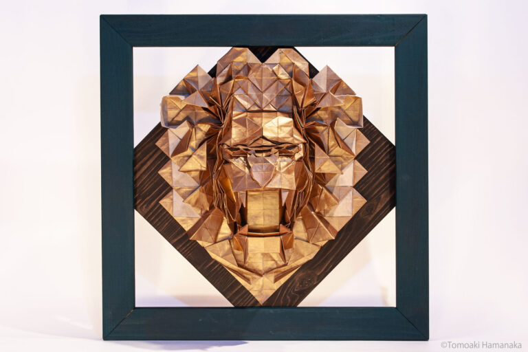
So, I looked for a plant that would give me that feeling of elation in the first place. What I found was a houseplant that incorporated the color “gold.
These were things like painting the leaves gold or using gold-colored potted plants.
Although I couldn’t see it clearly, I felt that the luxurious feeling of the gold color and the vivid green and life of the plants resonated and harmonized with each other.
I decided to use gold as the base color in order to incorporate this feeling. The results are the works shown here.
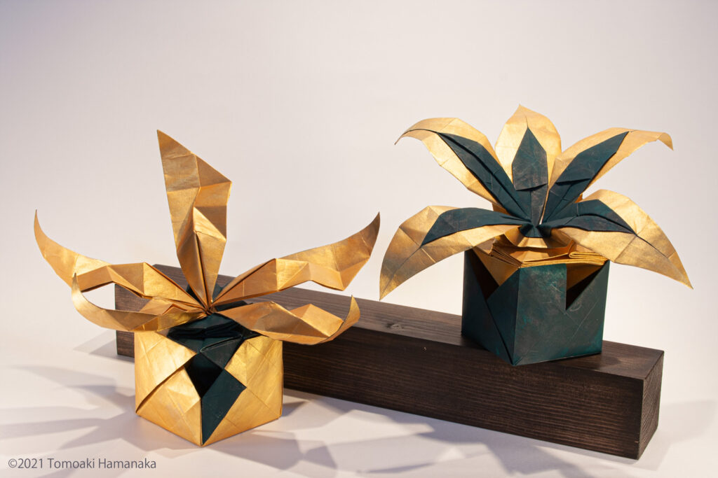
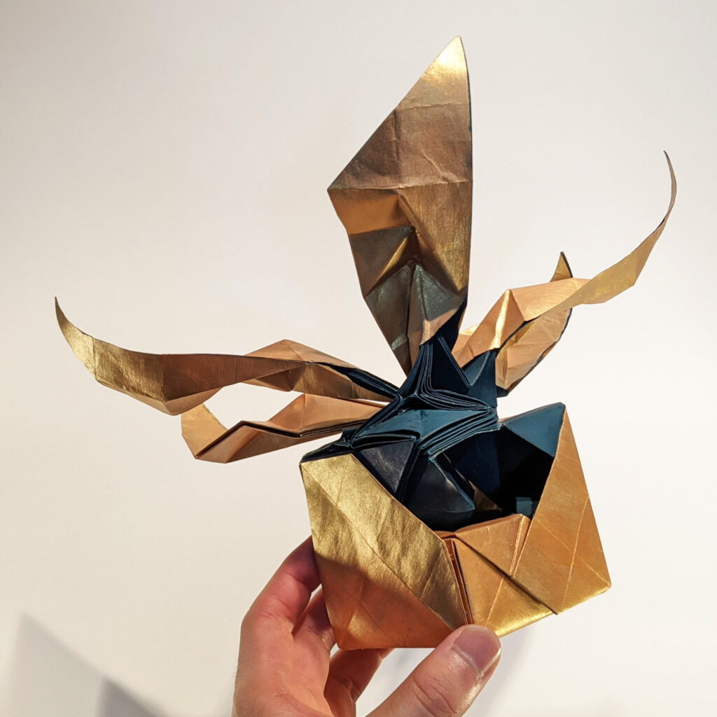
COMPLETE SHAPE
LIMITATION
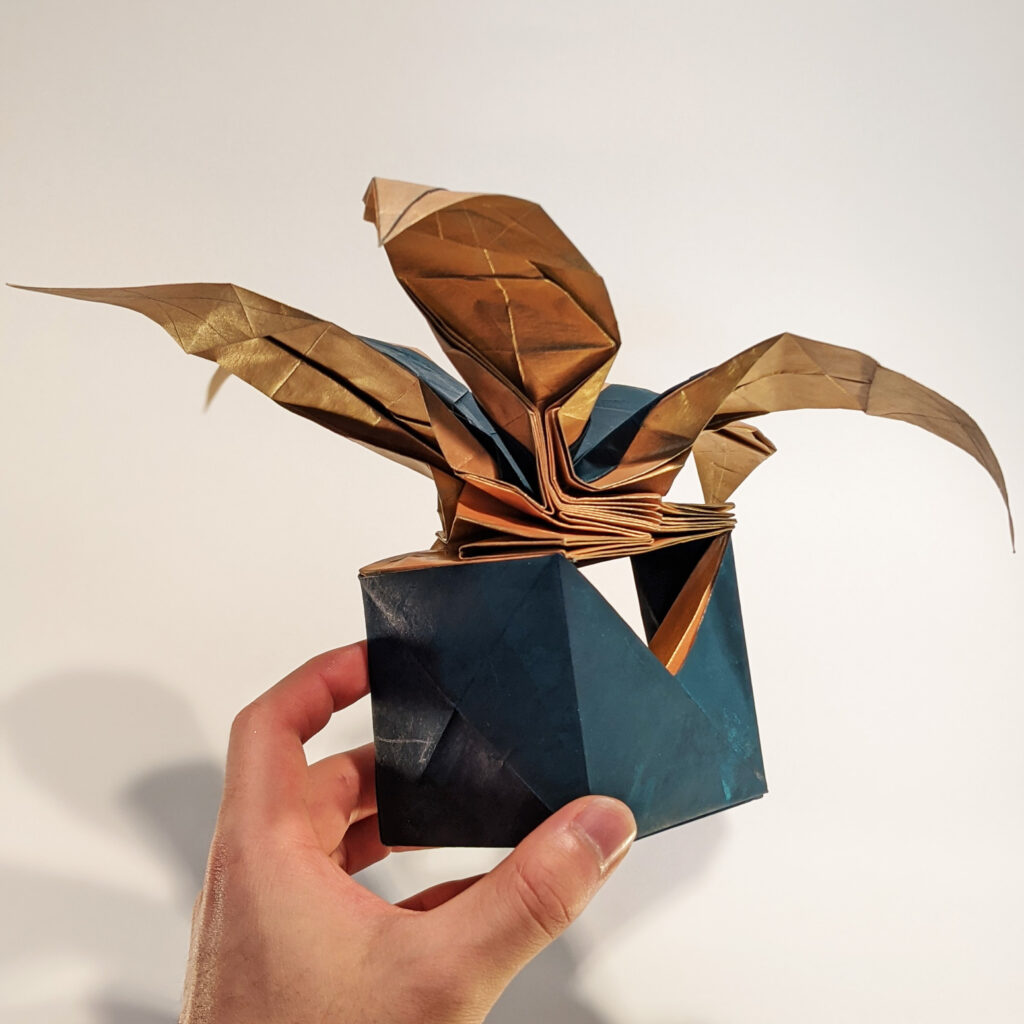
4-1. how to show the internal structure
Although it does not look good in the photo, I intentionally created a “hole” in this work. If you peek inside, you can see the fold that is built into the hole.
This is because I wanted to incorporate the fun of daring to create a hole that would normally be impossible to open.
In fact, I would like people to see more of the inside of this hole. Of course, it would be possible to have people see it if it were exhibited in reality.
However, I think we should not neglect the effort to make the best use of the medium of photography.
4-2. Variation in the shape of the bowl
The two works in this project were both made from the same basic shape, and the basic structure of the lower potted plant is also roughly the same.
In both cases, I think I was able to achieve a harmonious state in which the overall fold is meaningful without excess or deficiency.
However, it is possible to add more variations to the shape of the potted plants while maintaining the harmony. It will take time, of course, but this is an area that I would like to continue to research.
THANK YOU!
Thank you for reading this far. Today I feel that I have to think about how my work looks not only from my own point of view, but also from the point of view of others.
I would be very grateful if you could tell me what you think, in any and all ways.
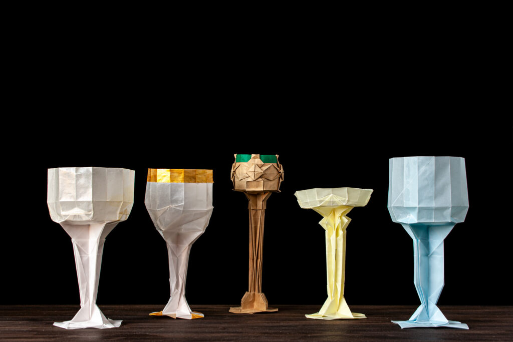
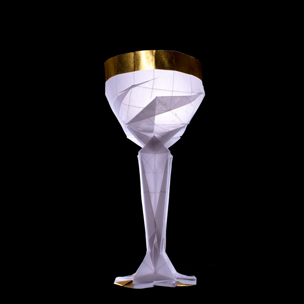
The wineglass was a subject I worked on for about four months, from November 2020 to March 2021. Following ORI-Light-Bulb, I started to design a more three-dimensional theme to pursue.
In the parallel works, ORI-Cow-Skull and ORI-Immature-Deer, I used the structure I discovered in this series. At the same time, many of the ideas that I came up with while making other works are also returned to these works.
In this sense, these works are not only a study of a single subject, but also an experimental field of origami techniques. The results of some of these experiments will be summarized in this article for the sake of organization and documentation.
1.CONCEPT
1-1. The beauty of contradiction
What is the situation in which two contradictory objects exist at the same time: a spear that can pierce anything and a shield that cannot be pierced by anything?
The simplest solution to this question would be if they are both a spear and a shield. It may sound like sophistry, but isn’t it possible to conduct a thought experiment in which two things coexist because they are identical? Contradictions arise when we separate two things that are originally one.
The same can be said for the division between three-dimension and flat. No matter how thin a piece of paper is, as long as it exists, it has a thickness. In other words, there is no such thing as a perfect “plane” in this world. A three-dimensional object and a flat surface are originally the same thing. Just like that contraption and shield.
There is only an ambiguous boundary between the two, drawn to make it easier for people to understand. Removing that boundary and liberating the perception narrowed by the symbol of language. This is the most important ideological background of this group of works.
1-2. “Translucency” of Paper
Paper has always been important in the choice of origami as a form of expression. Paper is thin, strong, and flexible. In order to create a work of art in harmony with reality, not in theory, we must deeply understand the properties of paper.
The layering of the paper, the tension, the friction between the papers. These are trivial elements that on their own have little effect, but are created by the act of folding. Feeling them on the skin is like a dialogue with paper.
What I focused on this time was the “translucency” of the paper. If you hold the paper up to the light, you can see the flow of fibers. It can be said to be mysterious.
Originally, wineglasses were made of glass. In order to reconstruct it using paper as a material, how to create a sense of translucency? This was the concept I explored in this group of works, as an extension of the theme of light bulbs.
1-3. Expressions born from the pursuit of methods
There are various design methods in origami: 22.5 degree system, circular region method, grid method. None of them can be way to perfectly reproduce the subject. We have to discard elements of it and abstract it to varying degrees.
As an approach to design, the degree of abstraction is the key to individuality. I like expressions that are located at the boundary between realism and abstraction. This is because at the boundary, the elements of both sides of the divide come together, and we are reminded that the boundary does not exist originally.
What appears to be nothing more than paint scattered in a haphazard manner or countless layers of paper when viewed up close, appears to be a landscape or animal when taken a step back. I am looking for the wonder of multiple states living together in a single work.
For this reason, I choose the technique of grid method. By using it, we can relatively easy to preserve the overlapping of the paper and the beautiful straight lines in the finished work. And, we can seek a space between realism and abstraction.
In order to preserve the lines created by just folding the paper, unnecessary folds have to be eliminated. This is also the theme of this series of works.
Technically, it is also important to be able to incorporate two kinds of sharp angles, tanθ=1/2 and 1/3, in a very natural way. This is because even when the paper is folded as it is, a rich variety of expressions are possible.
Another point that should not be overlooked is the ease of incorporating three-dimensional structures. The coexistence of two-dimensional and three-dimensional structures can be incorporated into the structure without difficulty.
In this way, by considering the design method, the best expression for the method can sometimes be created naturally. By using such expressions intuitively obtained, we can further deepen our understanding of the design method. I was able to gain such awareness in this group of works.
2.DESIGN
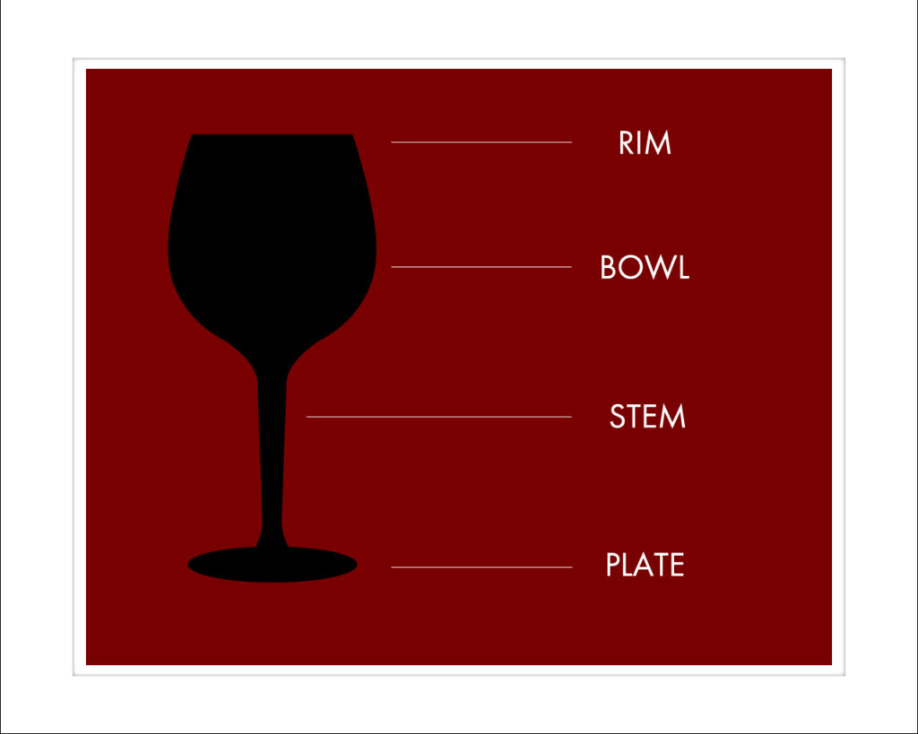
2-0. Consideration for wineglass
In preparation for the design, I first gathered basic knowledge about wineglasses. The names of the various parts are shown in the figure. I collected materials and sketched various forms of champagne glasses, ones for red wine, for white wine, and crystal wineglasses.
I actually bought a wineglass and poured wine into it. If you can get your hands on the real thing, there’s no better way to do it. This is because we can get a sense of touch, weight, and attachment that we cannot get just by looking at an image.
At the time, however, I was still exploring design methods, so I was working on my studies and observing the subject at the same time. I remember that each time I made a study, I became aware of my lack of understanding of the subject and returned to observation.
2-1. About the Bowl
The first thing I started to fold was the bowl, which occupies the largest part of the wineglass. At first, I imagined that it would be relatively easy to make a prototype by applying the structure used for the glass part of the light bulb.
However, it was unexpectedly difficult to reconstruct the gentle curves peculiar to wineglasses with straight lines. If I tried to create a three-dimensional structure while maintaining the gentle outline, I would end up with a very unstable structure.
The problem I realized later was that I was trying to make a complete outline directly. It’s like crumpling up a piece of paper and waiting for it to happen to take the shape of a wineglass.
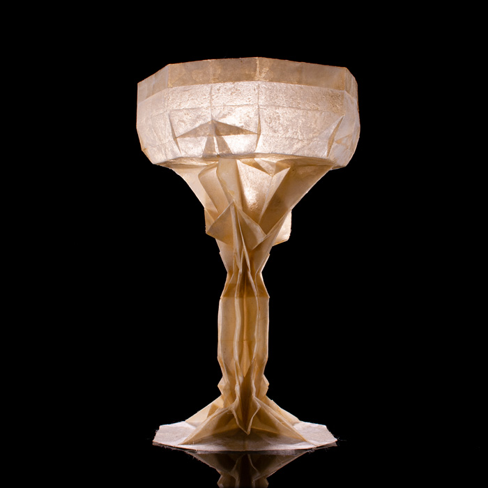
The solution, which worked after many attempts, was to make a rectangle with a square base and then cut off the corners. This method allows you to create a certain degree of solidity when making a rectangular object.
After that, the corners can be sunk to create a fastening fold, which will further secure the shape. The fact that I found multiple ways to cut this shape will lead to the development of variations.
2-2. From Stem to Plate
The first thing I thought of as a way to express the stem and plate was to use a structure like a clown’s collar. I thought it would be possible to form a beautiful circle by spreading the folds evenly.
At the stage of study, it seemed to be a success because it could express the neckline of the stem. However, it spread out without using a glue. It is not stable when displayed. It was a failure because of the imbalance between the accuracy of the molding and the bowl.
In this part, the solution was to make it three-dimensional after it was foldable. This was also a solution for this part, because folding it flat would lead to some degree of folds.
Also, by creating a foldable state, the difficulty of the folding process could be greatly reduced. The index of foldability will be used to evaluate the stability of the structure in future works.
2-3. Improving the Bowl, Stem, and Plate
After designing the basic structure in each part, I tried out several patterns while keeping an eye on the overall balance. To be honest, once you get to this stage, the rest is not so difficult. All we had to do was to observe the changes that appeared by shifting the placement of each structure little by little.
The most significant improvement was the inclusion of a gluing allowance. Of course, the ratio of the bowl to the stem can be adjusted by changing the number of squares, or the number of grids.
What I have created this time is just a part of its countless derivatives. This, I think, is one of the interesting aspects of origami. In other words, if you can tell someone how to fold one basic shape, they can make any shape they like.
Moreover, if the basic shape is the same, it is easy to inherit the characteristics of the original creator to some extent. This is one of the reasons why I consider origami to be a “shareable” art form.
2-4. Expression of the rim, cut glass, and stem
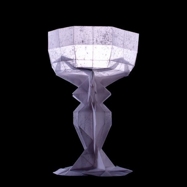
The problem in approaching the finished product from the basic structure was to create a beautiful symmetry. The bowl must be kept in the correct octagonal shape. The connection from the bowl to the stem to the plate must be vertical.
Easy enough to think about, but in reality, the symmetry is easily broken due to the precision of the folding and the thickness of the paper.
The method I used as a solution is called wet folding. Once the paper is wet, it is fixed and dried to make it easier to keep its shape. In this case, I folded the paper to the finished shape and used a humidifier to moisten the entire paper evenly so that the shape would not collapse.
The lesson to be learned is that you should not use tracing paper for wet folding. If you wet it too much, the paper will curl up and easily fall apart from the folds.
There is one more technique that worked well for keeping the shape of the bowl. That was to fold the edges of the paper inward as an expression of the rim. By increasing the strength of the rim, it becomes easier to maintain the shape.
Also, since the back side of the paper can be exposed, the rim can be made golden with partial backing. This is not a bad way to create a luxurious look.
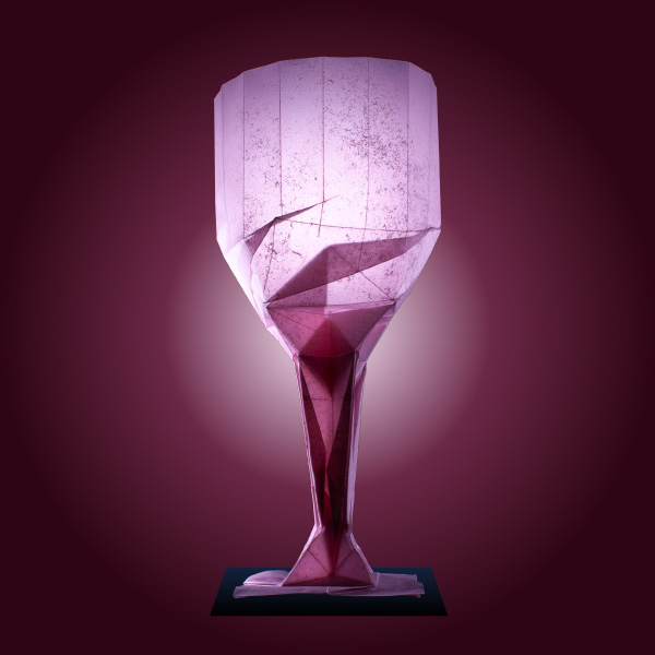
The latest version (a-3) at the moment focuses more on the expression of cut glass. By adding a twist to the connection between the bowl and stem, I was able to further improve the strength and shape.
In addition to that, by changing the width of the stem, I was able to create a more delicate expression. This is the end of the wine glass series for now, but there are still a lot of expressions I want to try, and I’m sure I’ll fold them again.
2-5. Considerations on Paper
In the wineglass series, I pursued the expression of “translucency” with paper, following the “light bulb with origami”. The first paper I used was tracing paper.
It is very difficult to fold, because it starts to tear from the crease immediately, but it has an excellent “translucency”. However, it is not suitable for delicate expression.
When I was looking for a better paper, I remembered shoji paper. It is the best paper for transmitting light, isn’t it? Furthermore, by applying varnish or lacquer, it is possible to create a mysterious “translucent” feeling.
I went to a washi specialty store to find the best paper and folded the latest version of a-3. I was reminded of the potential of it. Expanding the range of expression in origami by processing paper will definitely be a common theme in my future works.
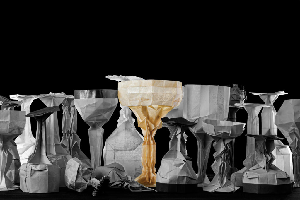
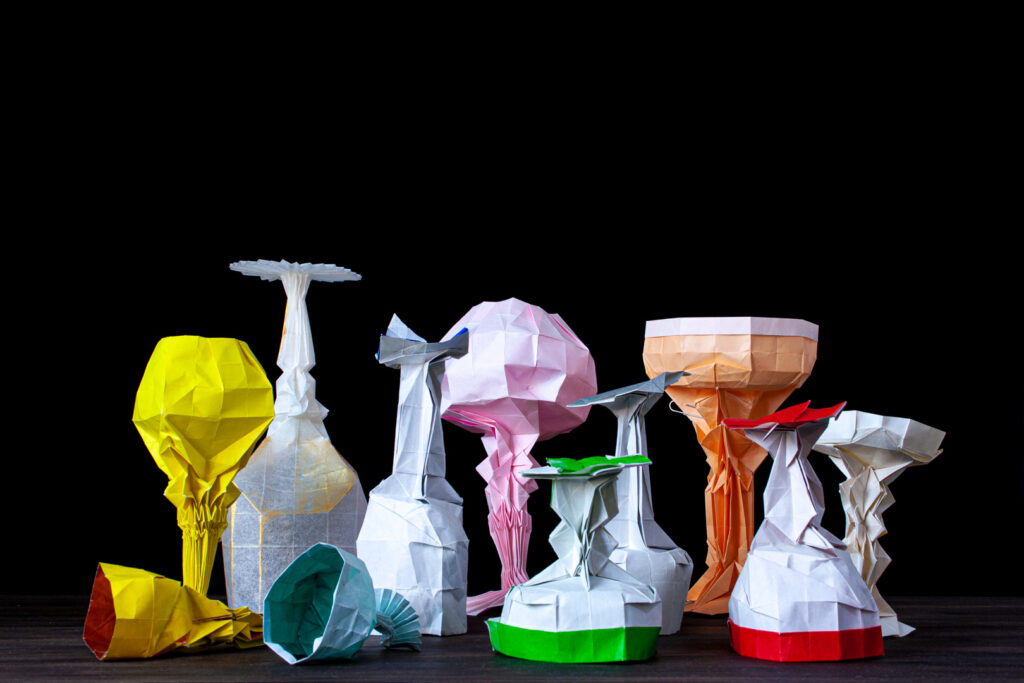
3.COMPLETE SHAPE
3-1. About variations
●a series
There are three series, a series, b series, and c series, depending on the method of stereolithography. The a-series is the most stable at the moment. It is the only one that uses a 22.5 degree stereoscopic structure, which makes it easier to maintain symmetry. 3-2.
●b series
3-2. Viewing from all directions
All of the works in this series can be enjoyed from any angle in 360 degrees. In the future, I would like to use VR and 360-degree photography technology to make them viewable in digital space as well.
3-3. Wineglass as a three-dimensional tessellation
The use of translucent paper also means that we can enjoy the patterns created by the overlapping of the paper, like tessellation. I have explored several structures for incorporating patterns into bowls, but they tend to be too complicated as the number of grids must inevitably be increased.
It is also necessary to develop the expressive power of tessellation. In order to apply tessellation as a three-dimensional object, I need to increase my stock of expression on a flat surface. This idea will be explored in the next series of wine bottles.
4.LIMITATION
4-1. About display
The wineglass series is a work that can be viewed from anywhere in 360 degrees. However, the problem is how to display it. In addition, the work looks most beautiful when it is illuminated from behind with strong light. There are a number of ways to do this, such as using a mirror or lighting from below in a dark room, but it still requires a good deal of preparation.
There is one thing that comes to mind when I see an exhibit at a museum that can be described as having the most sophisticated exhibits. The space around the work is just as important as the work itself in order to produce the true value of the work. I believe that I have to focus on not only how to create the work, but how to direct it.
4-2. Use of varnish and lacquer
There is a lot of room for research in the use of varnish, a technique I tried in a-3. In this case, I applied varnish after completing the work, but what about folding the work after applying varnish? What about folding after varnishing, or folding on pre-varnished paper and then varnishing again? How about using opaque lacquer to increase the strength of the work instead of translucency? There are many issues to be solved.
5.THANK YOU
If there are any of you who have read this lengthy article to this point, I would like to shake your hand firmly. (virtually, of course)
Historically, it is common for people to talk about their own theories about art. Especially when it is not accepted as art. I am no exception, and whether the world accepts my work or not, I will leave my thoughts behind. So, if there are any picky readers out there, I’d be happy if you’d give it a try.


Leave a Reply