日本語版はこちら
I coined the name “ORI-INTERIOR” for this site because I wanted to create a culture in which people can display origami in their daily lives.
Origami, being made of paper, is light and can be easily displayed on walls and desks. The question is, how can we create works of art that blend into our daily lives?
A simple solution would be to use something that is already part of our daily lives. For example, houseplants or objects that hang on the wall.
In the process of designing such a subject, we can understand the elements necessary to decorate it in a comfortable way. That’s why I started this project with the theme of houseplants.
CONCEPT
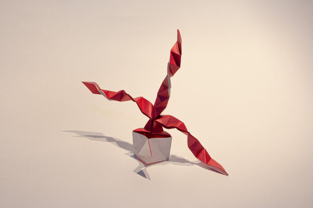
1-1. Abstracting Houseplants with Origami
The main concept of this project is the abstraction of houseplants. I break down the elements that make up a houseplant, and extract and reconstruct those that have a high affinity with origami.
By doing so, I aim to create something that looks like both a houseplant and paper.
I think that when we interpret a word, we compare it with the vague image we have of it. For example, when you see the word “houseplant,” that’s what you think of in your mind.
I want to actually take that vague image in my mind and look at it carefully.
That is why I want to make works that seem to waver on the boundary between the object itself and the origami.
In addition to this reason, there is also a more practical reason. As long as I am using paper, there is a limit to the number of corners I can efficiently create and the colors I can use.
Like a minimalist, I feel that paper is a material that requires me to maximize the power of limited resources and to push them to the limit.
1-2. Seamless connection between organic and inorganic expressions
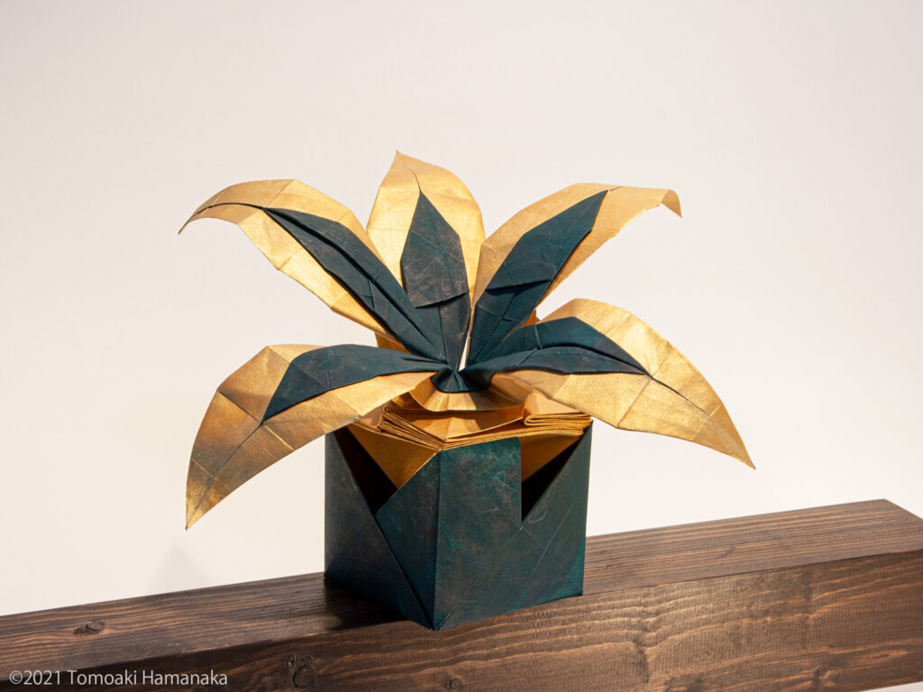
In most houseplants, the upper part of the plant is made up of organic matter, while the lower part is made up of inorganic matter such as potted plants. The composition of the present work is the same.
The material of paper connects the opposites of organic and inorganic materials to create an expression that is both organic and inorganic.
I was always thinking about how to mix them together in the most appropriate way.
DESIGN
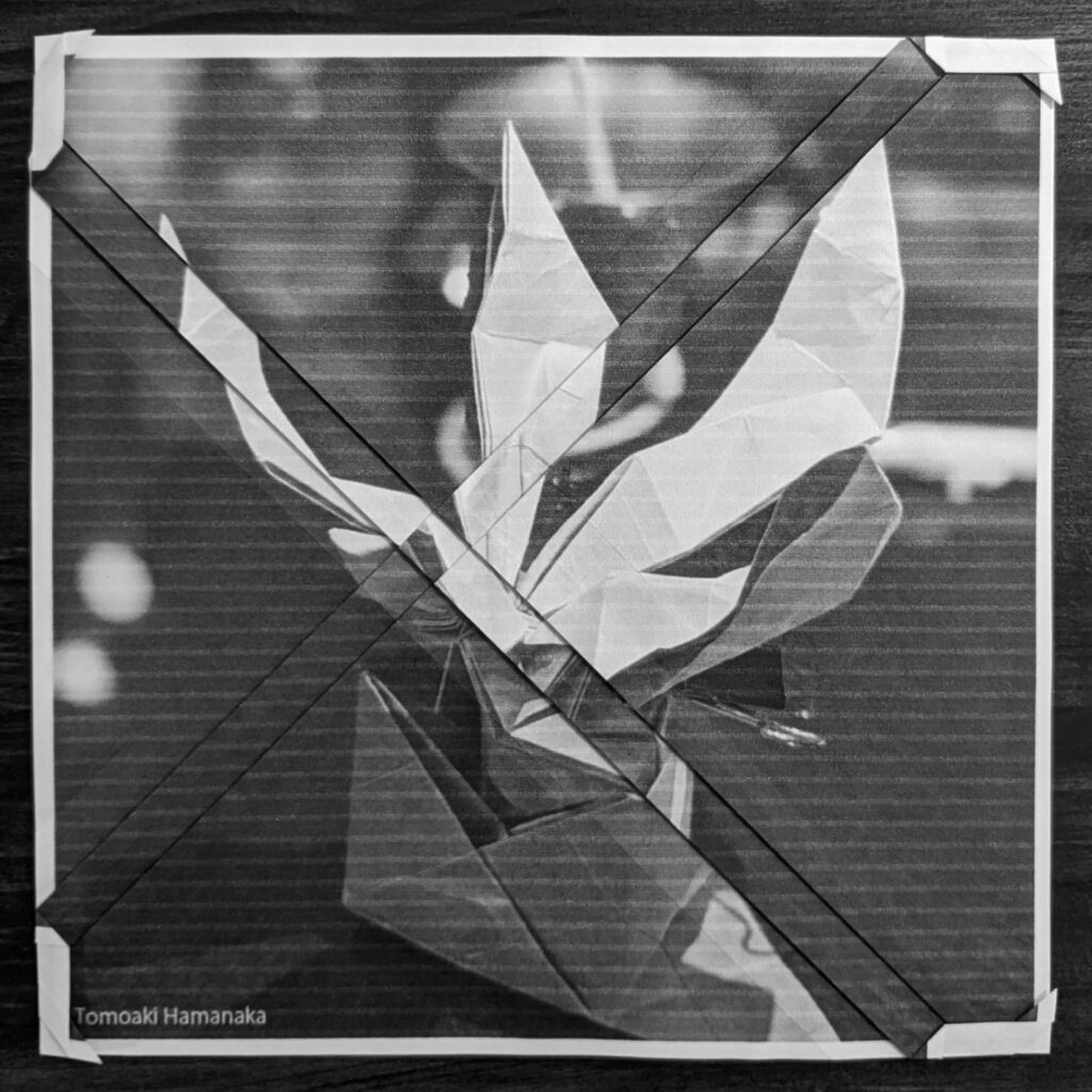
2-1. Consideration of structure from observation
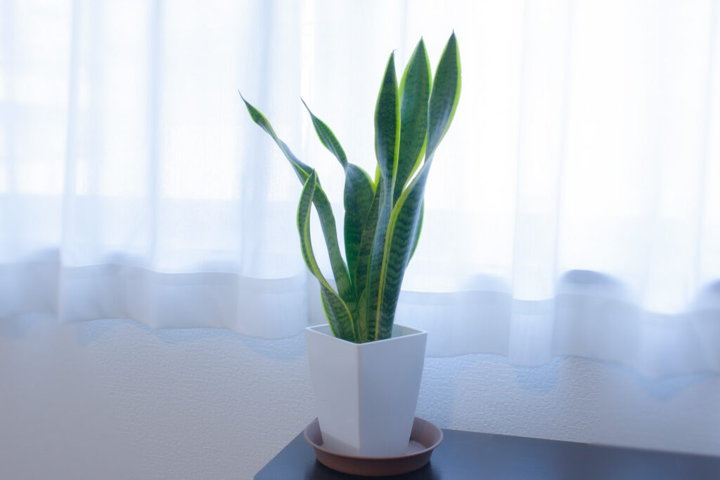
In this work, I did not dare to do much sketching. Instead, I touched and observed the real thing. By observing both the fake plant and the living plant, I tried to feel the difference between them.
What I wanted to represent was something in between.
When I first started, I struggled to increase the number of leaves. One day, however, I suddenly realized. What is the point of increasing the number of leaves?
A plant does not look like a plant because it has a large number of leaves. It is because each leaf has a beautiful “leaf” shape and color.
2-2. change in structure, change in approach to leaf expression
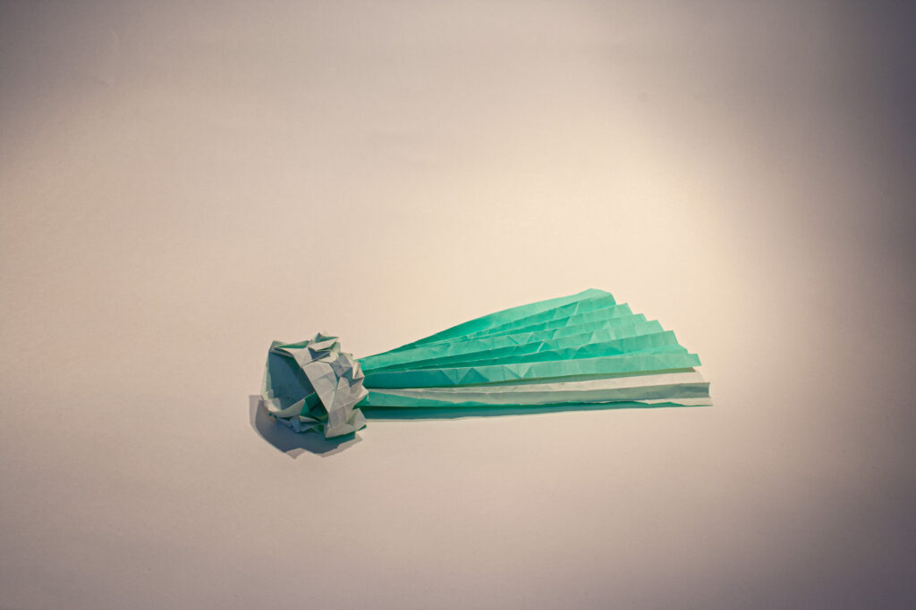
In the initial design, I used paper in the same way as in “ORI-WINEGLASS SERIES“. However, I could not make full use of the paper in that structure because it created an excess area.
Therefore, I changed the structure to a “diamond shape”, as they say in the origami world. It always amazes me that the best answer is always right beside us, but we don’t even know it exists until we realize it.
The moment we notice it, the paper naturally folds into a beautiful shape, as if it had been waiting for you.
2-3. On creating a sense of elation
When I see a good piece of art, even if I don’t know what it is, I feel a kind of elation.
When I had completed a certain form of the work, I felt that I could not feel that sense of elation from the work in front of me.
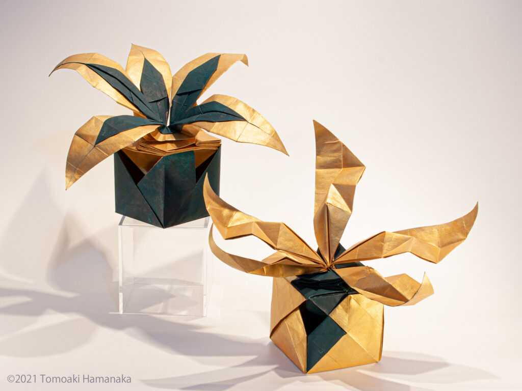
So, I looked for a plant that would give me that feeling of elation in the first place. What I found was a houseplant that incorporated the color “gold.
These were things like painting the leaves gold or using gold-colored potted plants.
Although I couldn’t see it clearly, I felt that the luxurious feeling of the gold color and the vivid green and life of the plants resonated and harmonized with each other.
I decided to use gold as the base color in order to incorporate this feeling. The results are the works shown here.
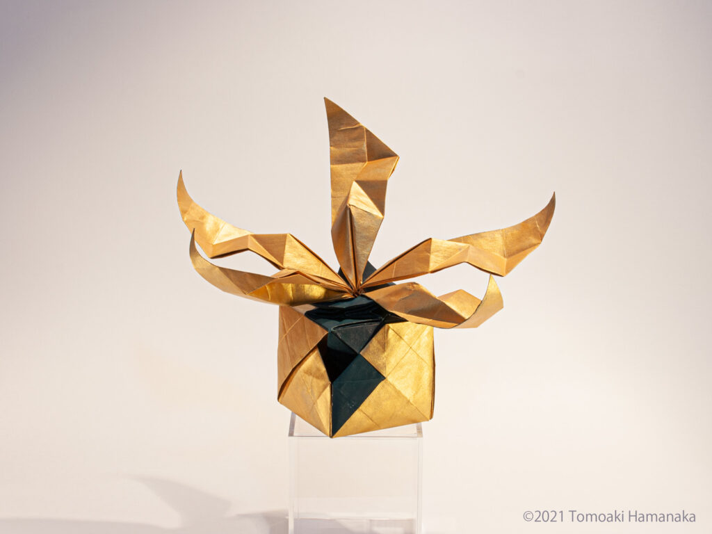
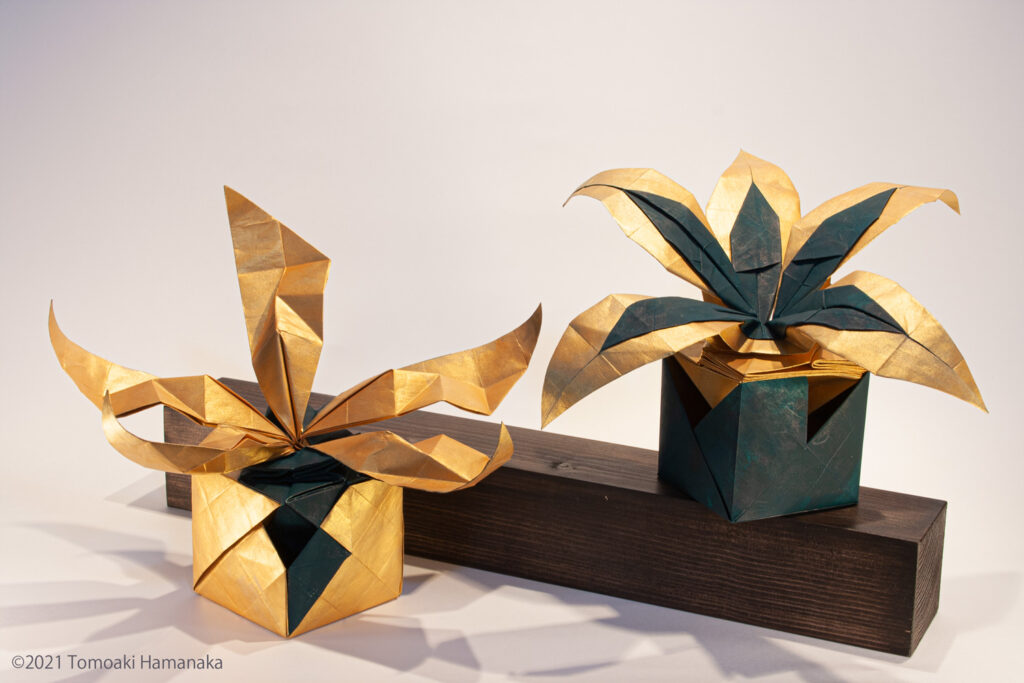
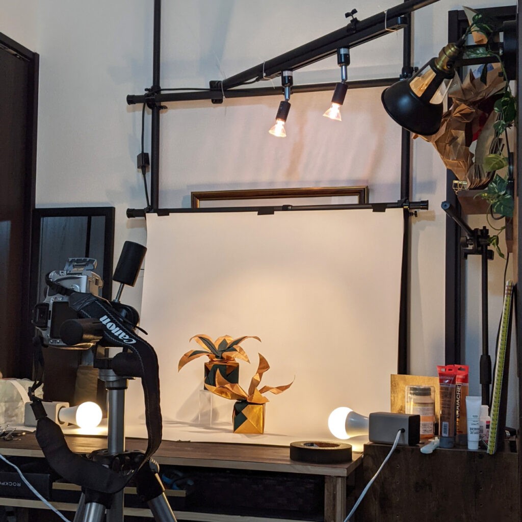
COMPLETE SHAPE
LIMITATION
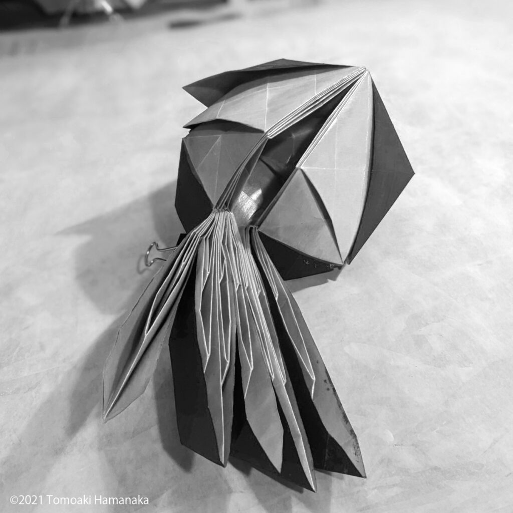
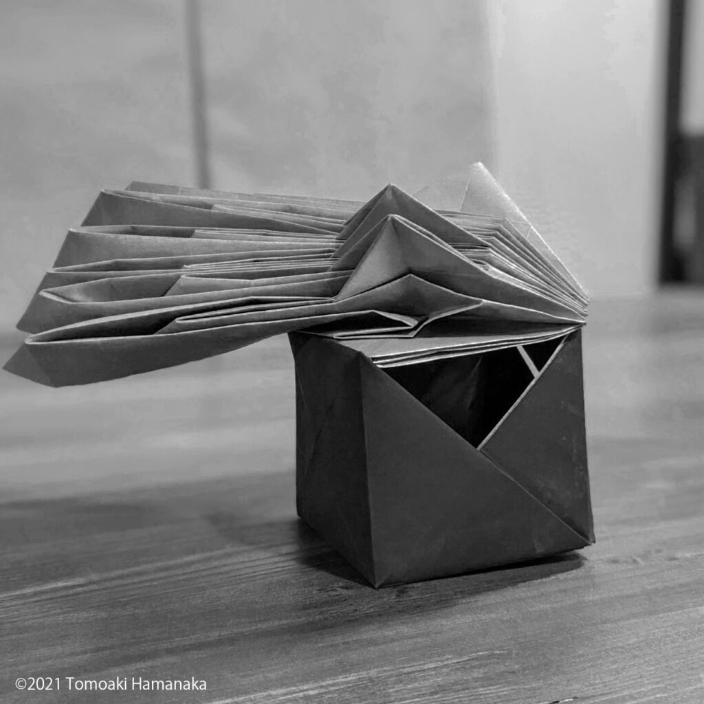
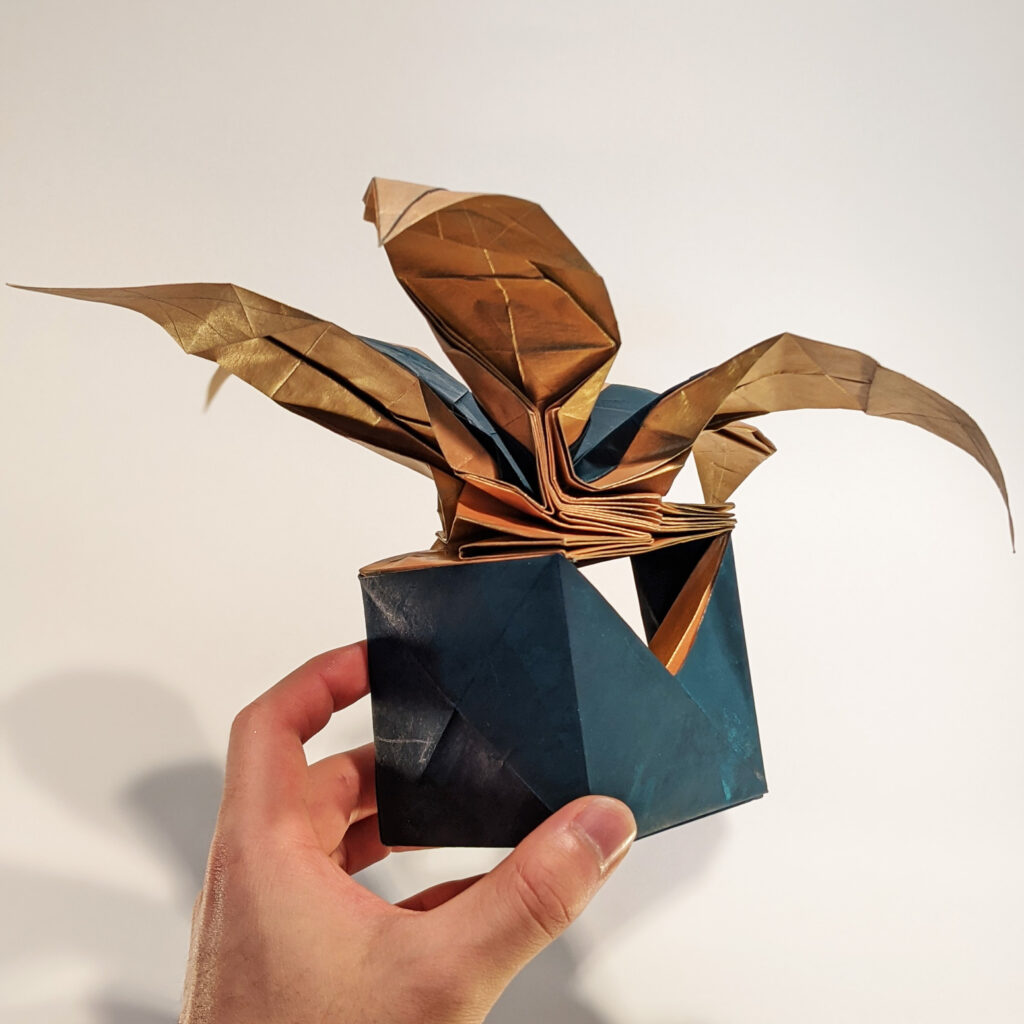
4-1. how to show the internal structure
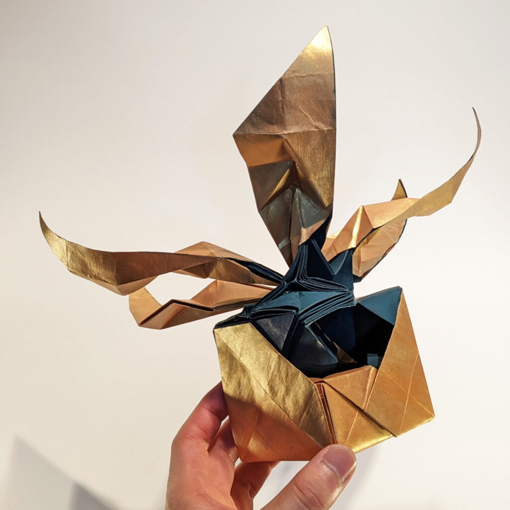
Although it does not look good in the photo, I intentionally created a “hole” in this work. If you peek inside, you can see the fold that is built into the hole.
This is because I wanted to incorporate the fun of daring to create a hole that would normally be impossible to open.
In fact, I would like people to see more of the inside of this hole. Of course, it would be possible to have people see it if it were exhibited in reality.
However, I think we should not neglect the effort to make the best use of the medium of photography.
4-2. Variation in the shape of the bowl
The two works in this project were both made from the same basic shape, and the basic structure of the lower potted plant is also roughly the same.
In both cases, I think I was able to achieve a harmonious state in which the overall fold is meaningful without excess or deficiency.
However, it is possible to add more variations to the shape of the potted plants while maintaining the harmony. It will take time, of course, but this is an area that I would like to continue to research.
THANK YOU!
Thank you for reading this far. Today I feel that I have to think about how my work looks not only from my own point of view, but also from the point of view of others.
I would be very grateful if you could tell me what you think, in any and all ways.
Tomoaki. H.
Leave a Reply